Homepage Revamp
Role:
Lead Product Designer
Design:
2025/07
Rollout:
2025/08-2026/02
Platform:
App·iOS & Android·Web
01
OVERVIEW
Turning Fragmented Modules into a Cohesive Discovery Journey
OUTCOMES
+37%
Homepage engagement rate
+21%
Interactions per user
+24%
Wishlist additions
+20%
Average product pages viewed
02
CHALLENGE
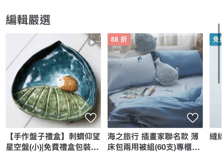
The Homepage Had Lost Its Discovery Journey


03
REFRAME
Two Distinct Modes of Discovery
Early discussions centered on competitor patterns and ideas for new homepage modules. I brought the conversation back to user needs, combining existing research with behavioral data to define two core user profiles and their discovery journeys. This clarified the role the homepage should play across different shopping intents.
Persona 01
Browse-led | Looking for inspiration and novelty
Without a specific purchase goal, these users repeatedly return to the homepage for new paths to explore
Persona 02
Search-led | Prioritizing efficiency and relevance
They arrive with a clear need and use search to quickly find and compare relevant products
04
GOAL
Reframing the Homepage Around Discovery
01
Set a distinctive brand tone from the first impression, helping both new and returning users immediately understand what makes Pinkoi different and reinforcing its mission: "Design the way you are."
02
Give campaigns and curated product stories greater visibility, making them easier to notice and understand.
03
Use behavioral signals to deliver real-time personalized recommendations, increasing relevance, engagement, and the value of returning to the homepage.
05
STRATEGY
Redesigning Discovery Through Product Experience and Content
We combined a consistent product experience with more timely, personalized content so the homepage could support brand storytelling, marketing visibility, and product discovery at once.
Strategy 01
Product experience | Rebuild content rhythm and discovery paths
We reorganized the content hierarchy, visual language, and interaction rhythm to create a more continuous browsing experience—allowing one piece of content to naturally lead into the next discovery path.
Strategy 02
Content strategy | Increase freshness and relevance
We introduced timely content and recommendation logic that adapts to different contexts and user intents, helping people reach relevant products faster.
06
DESIGN PRINCIPLES
Turning Strategy into the Homepage Experience
We translated the strategy into three design principles to keep content, interactions, and discovery paths consistent.
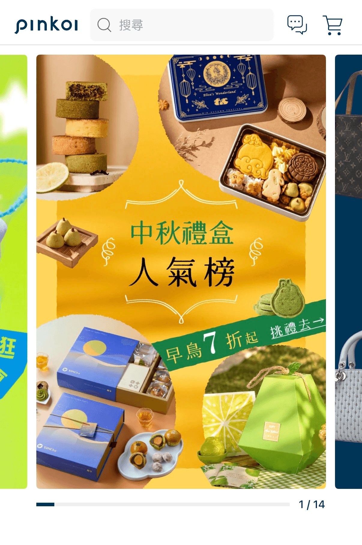
01 Story-led
The homepage should not feel like a product list. It should begin with themes, contexts, and visuals that invite users into Pinkoi's world of discovery. Moving beyond the traditional horizontal banner, we introduced tall, mobile-first imagery to create a more immersive focal point while improving content and copy readability.
Previous banners often delivered CTRs below 1%. The new format created more room for storytelling and renewed attention and engagement with curated content.
02 Immersive & Adaptive
Hero Image → Extract Color → Generate Gradient
03 Continuous Discovery
The homepage serves two discovery needs: goal-oriented users expect relevant content, while casual browsers need a continuous sense of inspiration and novelty.
I interleaved personalized recommendations, editorial themes, and continuous browsing, then added an infinite "You May Also Like" feed near the end of the page so discovery could continue rather than stop at the bottom.
Product cards also gained multi-image browsing, wishlisting, and sales signals, helping users assess interest and popularity faster while reducing decision effort.
07
METRICS
Hypotheses & Metrics
We translated the homepage goals into measurable metrics and instrumented key interactions and interface details. This allowed us to evaluate the redesign while testing long-standing assumptions against real user behavior after launch.
Did overall discovery improve?
Which content genuinely attracts users?
Where does discovery break down?
Because horizontal modules had historically underperformed, the team had come to believe that users simply did not swipe through horizontal content, leading most layouts to favor vertical stacking. I challenged that assumption: low engagement might not be caused by the horizontal format itself, but by content quality, relevance, placement, or visual execution.
The redesign therefore retained and reworked horizontal discovery, with behavioral tracking added to observe actual swipe and click behavior. This gave future layout decisions a stronger foundation in real usage data.
Previous · Repeated vertical layout
New · Horizontal discovery
The previous design relied on repeated vertical modules. The redesign reintroduced horizontal discovery and tracked real swipe and click behavior.
08
OUTCOME
PRODUCT IMPACT
+37%
Homepage engagement rate
+21%
Interactions per user
+24%
Wishlist additions
+20%
Average product pages viewed
01
02
03
This redesign went beyond rearranging content. It rebuilt the discovery rhythm and content hierarchy, turning the homepage from a collection of isolated modules into a cohesive entry point for brand, content, and product discovery.
09
FINAL DESIGN
Something New Every Time You Open the Homepage
A progressive discovery journey built around occasions, recipients, and inspiration packs—helping users move from "I don't know what to give" to the right product with ease.


10
TAKEAWAYS
From Strategy and Data to Shared Direction
01
First define who we are designing for and what role the homepage should play—then decide what belongs on it.
02
Historical data tells us what happened, but it cannot always explain why.
03
Design impact comes not only from the output, but from turning complex problems into a direction that cross-functional teams can understand, discuss, and adopt together.

